![[Experimental]](https://lifecycle.r-lib.org/articles/figures/lifecycle-experimental.svg)
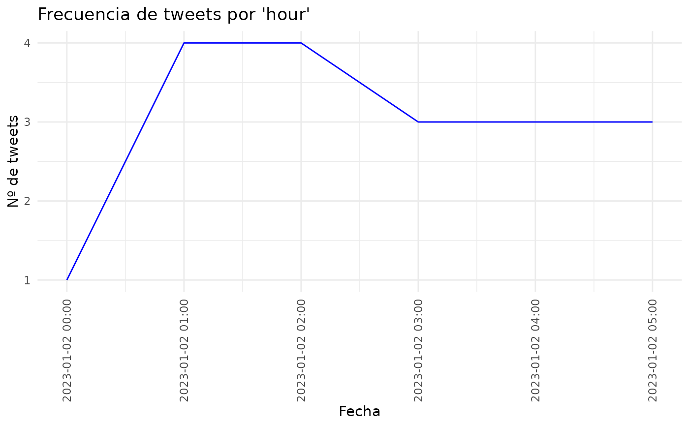
Esta función toma un dataframe de tweets y crea un gráfico de líneas mostrando la frecuencia de tweets a lo largo del tiempo, con opciones para agrupar por hora, día, semana, mes o año.
Examples
df <- data.frame(fecha = c(
  seq(as.POSIXct("2023-01-02 00:00:00"), by = "hour", length.out = 3),
  seq(as.POSIXct("2023-01-02 01:00:00"), by = "hour", length.out = 2),
  seq(as.POSIXct("2023-01-02 03:00:00"), by = "hour", length.out = 3),
  seq(as.POSIXct("2023-01-02 01:00:00"), by = "hour", length.out = 2),
  seq(as.POSIXct("2023-01-02 03:00:00"), by = "hour", length.out = 3),
  seq(as.POSIXct("2023-01-02 01:00:00"), by = "hour", length.out = 2),
  seq(as.POSIXct("2023-01-02 03:00:00"), by = "hour", length.out = 3)
))
plotTime(df, group_by = "hour")